.jpg) |
Not for the needle-phobes – innovative lettering from Barcelona-based Lo Siento uses food-dye-filled bubble wrap to create this super-tactile piece for Wired Magazine.
(Selected by Rosi Digne-Malcolm, Junior Designer) |
Monday, 30 September 2013
Things we like... PART #01


Thursday, 19 September 2013
London Design Festival 2013
The London Design Festival is held each year to celebrate and promote London as the design
capital of the world, and as the gateway to the international creative
community. It is in full swing right now and here at Assembly we've been busy picking the best bits - one of the events was the launch party for a Feix&Merlin pop-up shop in Seven Dials, Covent Garden.
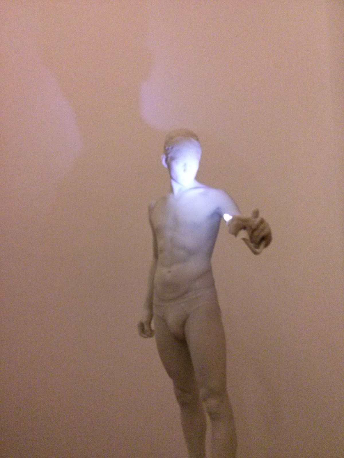
Feix&Merlin Architects and artist Nathaniel Rackowe collaborated on an experimental temporary installation on the ground floor of the shop. It bears the mystic name eLP44 and not only does it disconcert by its name, but also when you see your reflection in it!


As a viewer you move through the mirrored film installation and see the environment changing constantly - asking you to reassess the your relationship with the surrounding architecture.
Check out some more images below, which show the collection of product and lighting designs launched yesterday.


London Design Festival is still running until 22 September 2013, so do check it out if you get a chance!
Feix&Merlin Architects and artist Nathaniel Rackowe collaborated on an experimental temporary installation on the ground floor of the shop. It bears the mystic name eLP44 and not only does it disconcert by its name, but also when you see your reflection in it!


As a viewer you move through the mirrored film installation and see the environment changing constantly - asking you to reassess the your relationship with the surrounding architecture.
Check out some more images below, which show the collection of product and lighting designs launched yesterday.



London Design Festival is still running until 22 September 2013, so do check it out if you get a chance!
Thursday, 29 August 2013
The Future's Bright: A New Way To Paint With Light

While exploring 3D light
projections for a recent research & development
project, I came across
a fascinating concept
that uses light to bring seemingly banal spaces to
life. As I have a
background in photography, I was intrigued by the way this
installation demonstrated the way
you can literally paint a scene with light
to reveal aspects of your
choosing. This gives you control over how a viewer
interprets the
space and, in a sense, you become the director of your own creation.
I have seen a number of
similar light projection projects using buildings
as a canvas, but this is
more unusual, more abstract and at a different
scale; in a way you could say
it is more liberated than its predecessors. The input and control from widely
available kinetic devices makes me wonder whether such projections will
become
more widespread in the future, grasping public attention and imagination in
much the same way as 3D printing, bringing this dynamic
and exciting art form
to the masses. I for one hope so.
Patterns Emerge, by Nature Graphique can be seen online here.
(Written by David Connolly, Assembly Studios' Head of CGI)
-------------------------------------------------------------------------
-------------------------------------------------------------------------
Download our Guide "Zero Risk Approach to CGI "
- Email Marketing by GetResponse
Designing the Unimaginable

Hansmeyer has taken
inspiration from nature, specifically the division of cells, to design a
process that can then be used to create new and ‘unimaginable’ shapes and
structures. The idea is simple: take a cube, and fold it, and fold it, and fold
it, sometimes hundreds and thousands of times. The creation of a computer
algorithm makes this process, that is both simple, yet impossible for humans to
carry out, feasible. The outcome is anything but simple: resulting shapes are
so deeply complex that they push the limits of what the human eye can see.
Millions of surfaces weave and intersect in organic flourishes, reminiscent of
microscopic details of crystalline structures.

The talk certainly
raises interesting questions about the limits and applications of the human
imagination, but more than this, it showcases some genuinely awe-inspiring
architectural forms. The resulting structures are reminiscent of a
post-apocalyptic landscape that wouldn’t look out of place in films like Alien
or Oblivion.
Could these forms be
scaled up into human colonies to meet the needs of overpopulated cities? I’m
not sure, but I’m certainly enjoying imagining it!
Building Unimaginable
Shapes can be viewed here.
(Written by Richard Conner, Assembly Studios' Managing Director).
(Written by Richard Conner, Assembly Studios' Managing Director).
What do you think?
Share your thoughts below.
----------------------------------------------------------------
----------------------------------------------------------------
Thursday, 8 August 2013
Eid Mubarak to the Middle East!
Also called the Feast of Breaking the Fast, Eid is celebrated by Muslims
worldwide to mark the end of Ramadan. Our UAE based designer Dina has
blessed us with this e-card - So Happy Eid from all at Assembly!

Friday, 26 July 2013
Apple's new interface – who needs green felt anyway?
Unless you've been living in a cave for the last month or so, you will know that Apple has unveiled it's new mobile operating system, iOS7, complete with shiny new interface, which seeks to keep the iPhone abreast of its main competitors in the market, Microsoft's Windows Phone and Google's Android platform. At first glance iOS7 looks to do away with those old-timey real world imitation design elements of its previous iOS6 interface, such as the faux-wood bookshelves of the Newsstand application and the green felt casino table from Gamecenter. Both these examples are skeuomorphs, objects or features that are 'copying the design of a similar artefact in another material'. In the world of interface design, skeuomorphs can also relate to behaviour and physicality (think of 'turning' the pages of a document in iBooks or the 3D button-like appearance of icons on the homescreen).
Apple has been widely criticised over its use of skeuomorphism for well over a year, the bombardment gathering momentum and support across the Internet, from techblogs to the graphic design community. So it seems that with this latest announcement Apple have finally given in to the mob, and on the face of it, it seems they may have a point; who needs green felt when all you want to do is beat your highscore on Angry Birds whilst waiting for the train? Nevertheless, there are a few pertinent issues to consider before firmly stomping all over skeuomorphism – and Apple's seemingly firm departure from it.
One way skeuomorphs can be useful in interfaces is that they assist users in working out the function of a particular feature: 'this looks like a button, so I assume that when I press it a feature or function will be activated'; 'this looks like a notepad, so I assume I can use it to write notes'. The importance of this particular aspect of skeuomorphism, especially when relating to interfaces for touchscreens, is that they can assist greatly in introducing inexperienced users to new concepts, ideas and functions. For example, touchscreens. More specifically, the multi-touch type of touchscreens first made widely available in mobile devices by Apple back in 2007, with the launch of the original iPhone. Until then, our experience of mobile phones was characterised by screens that were screens and buttons that were buttons. Suddenly, there's just one button and the screen is now the whole phone; pretty radical to say the least. Within a few years though, almost every phone on the market has this kind of technology and everyone and their mums can use a touchscreen without freaking out and reaching for a 3310. Why? Because, among other reasons, the interface was intuitive enough to allow them to get to grips with this new way of interacting with stuff.
Of course today the touchscreen is everywhere, not just in the mobile phone market but in tablets and now laptops too. We don't need to be taught how to use these devices any more, they are part of our everyday lives. They feel familiar, we know where the buttons are. Which is why the Windows 7 interface, launched in late 2010 with the Windows Phone 7, was such a success and single-handedly defined the 'anti-skeuomorph' model that designers and developers have praised and emulated left right and centre. With the Windows Phone Microsoft recognised the familiarity of the touchscreen interface and also realised we wouldn't get confused if all the buttons didn't look quite so button-like, thereby liberating mobile technology from heavy reliance on obviously skeuomorphic design. In the blink of an eye, Apple's on the back foot, Microsoft are on a charge and the world is predicting the iPhone's downfall. Green felt is out, flat colour is in. We have seen the future, and it is paved with flat coloured squares. Now, three years later (perhaps a little tardier than most would've liked), iOS7 is being touted as a Windows imitation, scrapping skeuomorphism altogether in favour of solid colour, gradients and Helvetica Neue.
But not all is as it seems. Skeuomorphism is still very much a part of the interface, in the behaviour of the features as well as what they look like, only this time around it's just that bit more subtle. The translucent, 'frosted glass' effect on the Control Center, for example, creates a sense of dimension and space, and the mysterious parallax effect on the homescreen seeks to give that space a physicality, a natural behaviour. And let's not forget, icons can be skeuomorphs too, from volume control to mailbox to calendar to compass to making a phonecall (crucially, Windows uses many of these skeuomorphs in its icon designs too). It seems with iOS7 Apple hasn't scrapped skeuomorphism at all, only used it more intelligently and in a less invasive manner, in a way that enhances the experience of using an iPhone and (finally) takes iOS to a new level. With a launch this autumn, the sense of anticipation is palpable, but one thing's for certain: although it might not feature a single thread of leather stitching, skeuomorphism is going to be all over it.
(written by Rosi Digne-Malcolm, Junior Designer at Assembly Studios)
 | ||||||||
| Old and new – iOS 6 on the left and iOS 7 on the right |
One way skeuomorphs can be useful in interfaces is that they assist users in working out the function of a particular feature: 'this looks like a button, so I assume that when I press it a feature or function will be activated'; 'this looks like a notepad, so I assume I can use it to write notes'. The importance of this particular aspect of skeuomorphism, especially when relating to interfaces for touchscreens, is that they can assist greatly in introducing inexperienced users to new concepts, ideas and functions. For example, touchscreens. More specifically, the multi-touch type of touchscreens first made widely available in mobile devices by Apple back in 2007, with the launch of the original iPhone. Until then, our experience of mobile phones was characterised by screens that were screens and buttons that were buttons. Suddenly, there's just one button and the screen is now the whole phone; pretty radical to say the least. Within a few years though, almost every phone on the market has this kind of technology and everyone and their mums can use a touchscreen without freaking out and reaching for a 3310. Why? Because, among other reasons, the interface was intuitive enough to allow them to get to grips with this new way of interacting with stuff.
 |
| The good old Nokia 3310 |
But not all is as it seems. Skeuomorphism is still very much a part of the interface, in the behaviour of the features as well as what they look like, only this time around it's just that bit more subtle. The translucent, 'frosted glass' effect on the Control Center, for example, creates a sense of dimension and space, and the mysterious parallax effect on the homescreen seeks to give that space a physicality, a natural behaviour. And let's not forget, icons can be skeuomorphs too, from volume control to mailbox to calendar to compass to making a phonecall (crucially, Windows uses many of these skeuomorphs in its icon designs too). It seems with iOS7 Apple hasn't scrapped skeuomorphism at all, only used it more intelligently and in a less invasive manner, in a way that enhances the experience of using an iPhone and (finally) takes iOS to a new level. With a launch this autumn, the sense of anticipation is palpable, but one thing's for certain: although it might not feature a single thread of leather stitching, skeuomorphism is going to be all over it.
(written by Rosi Digne-Malcolm, Junior Designer at Assembly Studios)
Friday, 12 July 2013
Skate King's Cross
Skate King’s Cross, a pop up roller skate rink next to the stunning Granary building that hosts Central Saint Martins School of Arts and Design, was launched yesterday – and the Assembly folks were in the thick of the action again!

The roller disco is located in a former goods shed which was used in the Victorian era to store potatoes, fish and other perishable goods that were brought in by train before distribution across London.
Up and coming architects Feix & Merlin have set out to resurrect the area’s former legendary roller disco status (Canvas nightclub hosted events there in the past) by designing a rink surrounded by metal trusses with golden chains, re-kindling the old magic of the venue.

In an interview, David Partridge, director of Argent, mentioned that the rewarding thing about the transformation of King’s Cross was “seeing other people discover the area” – and the audience was indeed a mixed cool crowd!
If you fancy whizzing around on wheels like we did (watch Richard’s elegant moves!), the skate rink will be in place for eight weeks from today on.

Subscribe to:
Posts (Atom)